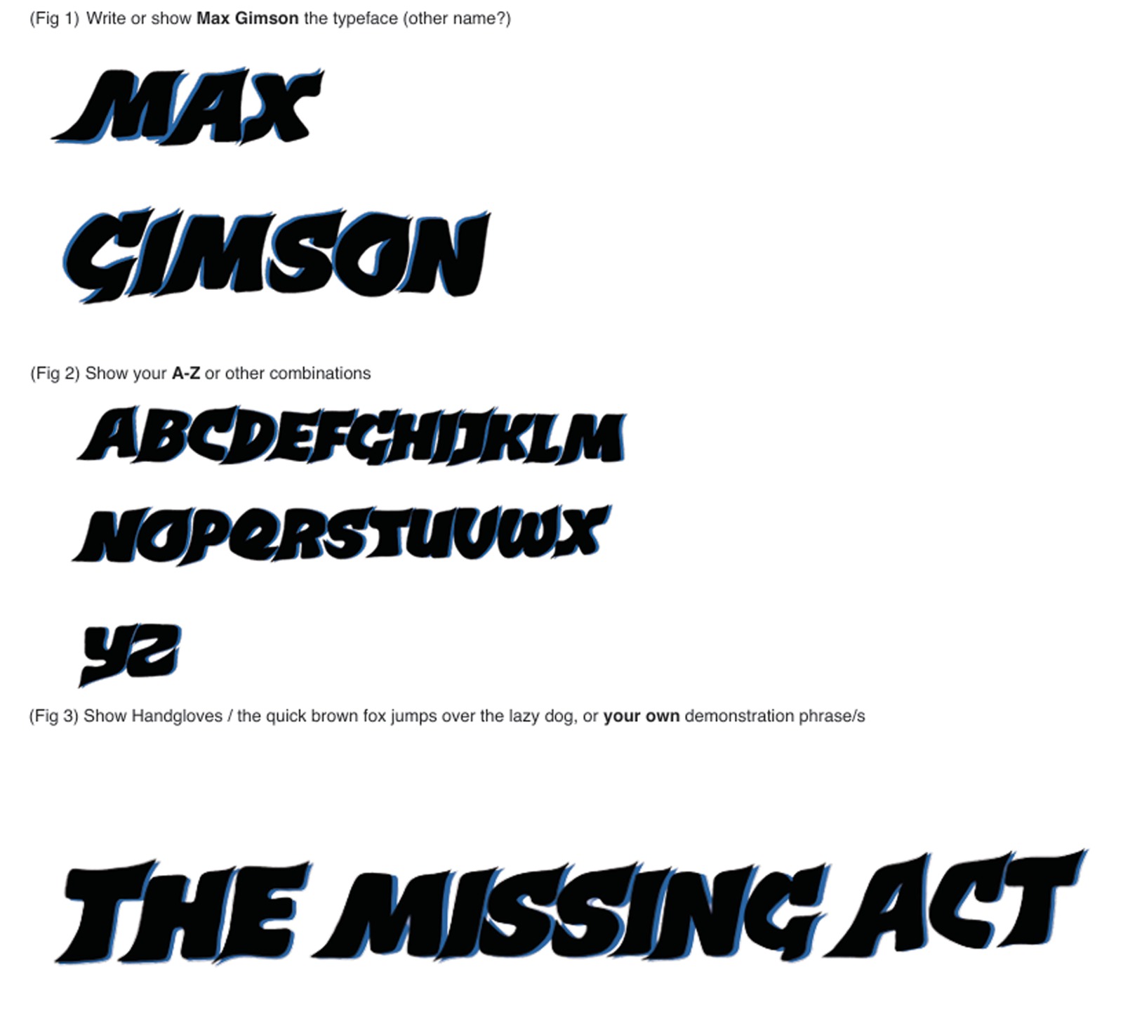
I decided to mix sharp edges on some ends of the letters with smooth edges on others for the
project “The Missing Act” to convey a sense of missing sharpness throughout the typeface. This
design choice allows each letter to have its own unique character while still maintaining a cohesive
appearance. My inspiration for this typeface came from the bold red letters of the “Babes in the
Wood” theatre advert, which really caught my attention. Drawing from this, I aimed to infuse my
typeface with a similar impactful quality.