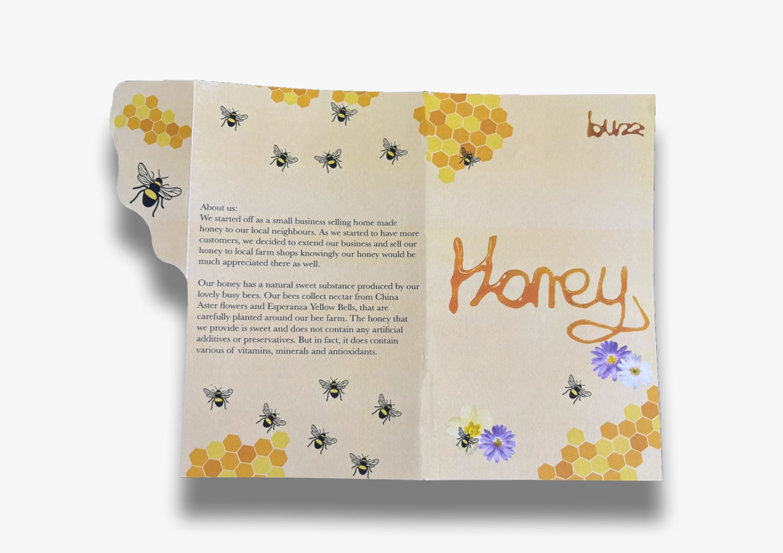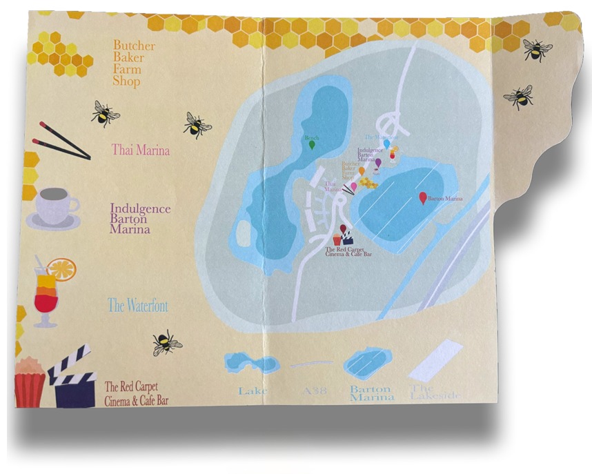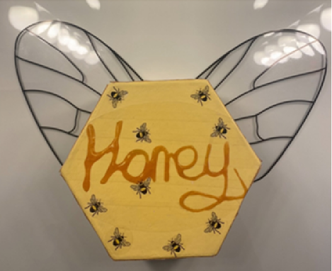
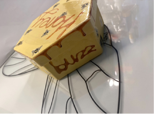
For my brand packaging, I decided to do a hexagon shape to represent a part of a
beehive. The stickers that we can see on top of the box are printed on Grafiprint from our
University’s DDH print studio. The wings are printed on acetate. The whole reason
behind the wings is to represent a bee’s wings for the packaging and to make it stand out
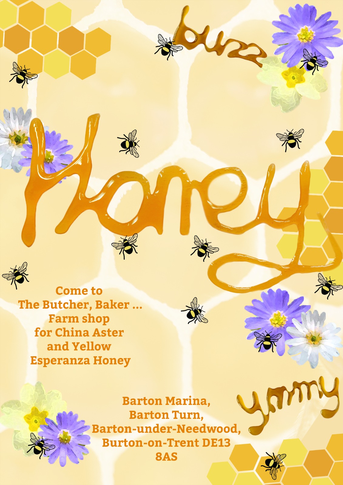
more from a regular honey jar packaging or gift set. The words we can see, such as
‘Honey’ and ‘buzz’ are written with actual honey then digitalised in Photoshop to make
some of the letters more readable, this way I had my own type created with the product
that I was creating a brand for.
For this project we were challenged to redesign a classic book cover in design sprint
format for the Penguin Cover Design Award The book cover that I decided to redesign
is The Strange Case of Dr Jekyll and Mr Hyde. The idea of the front cover for the book
came from a quote from the book “his face became suddenly black and features
seemed to melt and alter” which is where the melted face of Dr Jekyll became one of
the main features for the book cover. The glass sand timer represents Dr Jekyll’s time
running out and itis only a matter of time that he becomes Mr Hyde permanently.
